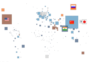
As the COP21 is ending in Paris, it’s interesting to see how data visualisation could bring the discussion to a wider audience. The Tableau viz below is an example of how Open Data and simple interactive graphics might make the information more accessible.
Blog / Tableau

