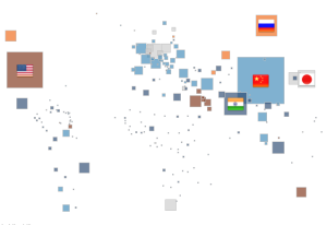
As the COP21 is ending in Paris, it’s interesting to see how data visualisation could bring the discussion to a wider audience. The Tableau viz below is an example of how Open Data and simple interactive graphics might make the information more accessible.
It’s great to see openprescribing.net generate conversations about prescribing habits
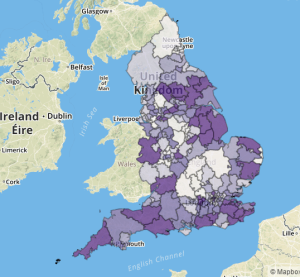
Open Prescribing is a neat and simple visualisation of monthly data on drugs prescribed by GPs in Engliand. it has has been collated at this site by Ben Goldacre among others. A great and simple viz that makes the data accessible to everyone to start conversations , which are now emerging on Twitter and elsewhere on the net. […]


