It was great to be able to use our experience and last years analyses to shrink this survey this year from over 150 questions in 30 minutes to a far more helpful set of TEN key questions done in FIVE minutes (including free text feedback of course). This follows our hard-won knowledge that the only […]
Is anyone doing great stuff with the patient comments in the NHS Friend and Family test?
Is anyone doing great stuff with friends and family data? Especially the free text comments which are by far the richest part of it. There are over one million pieces of feedback completed by patients each month. This has been building up for a number of years now at Trusts and GP surgeries. We explored […]
Just delivered our report on trainee feedback for the London School of Paediatrics
That was a fun project with a great team to work with as it so often is with engaged clinicians. A cross-hospital group of junior doctors and consultants had been running an annual feedback survey across all London trusts. With a few years’ worth of data under their belts they were feeling somewhat weighed down […]
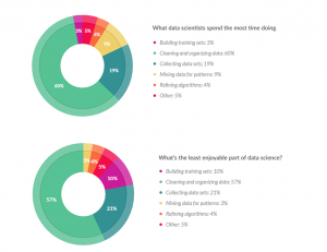
A cute little report on data scientists
A cute recent mini survey from Crowdflower tells us that data scientists spend way too much of their time assembling and sorting data and not enough mining and learning from them. Its a somewhat biased question style and hence pitch for their online services, but we can forgive them for the lovely clear, simple style […]
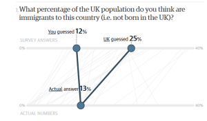
We only remember 10% of what we learn for ‘free’, but when we have to work for it knowledge sticks
As a ‘frequent supplier’ of information to audiences via reports and presentations, it sometimes feels that we give away information too cheaply when we present fully formed results, data and numbers. The audience can even convince themselves that they “knew the answers already” even though previous hypotheses of the group were often different when we […]
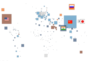
Understand CO2 emission using Open Data and Tableau
As the COP21 is ending in Paris, it’s interesting to see how data visualisation could bring the discussion to a wider audience. The Tableau viz below is an example of how Open Data and simple interactive graphics might make the information more accessible.
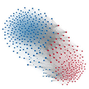
US politics and the rise of partisanship
With US election coming soon, analysts and commentators are all after the latest news from the parties, and speculate about political direction of the country. Mauro Martino and Clio Andris add one more piece to the puzzle. In their latest project, they bring to us their observation of the political scene and how the U.S. Congress polarized over the […]
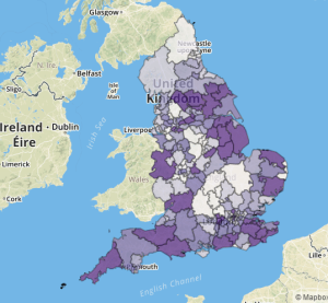
It’s great to see openprescribing.net generate conversations about prescribing habits
Open Prescribing is a neat and simple visualisation of monthly data on drugs prescribed by GPs in Engliand. it has has been collated at this site by Ben Goldacre among others. A great and simple viz that makes the data accessible to everyone to start conversations , which are now emerging on Twitter and elsewhere on the net. […]

